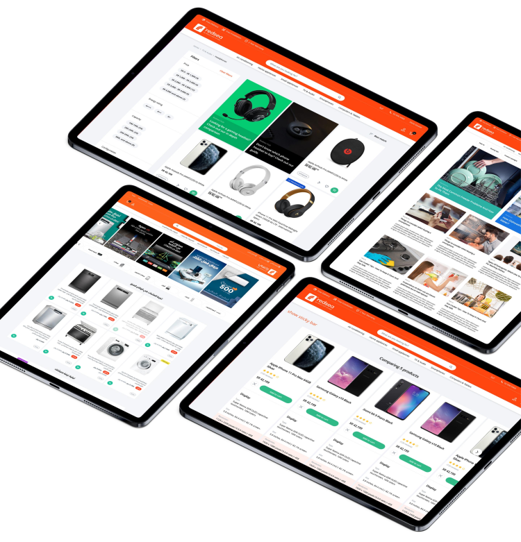
We built a lightning-fast headless storefront powered by Next.js for Redsea
Content x Commerce: Building An Immersive Ecommerce Experience
The team at Redsea approached us with an interesting challenge.
They wanted to re-engineer their website and migrate the backend from Magento 2.3 Enterprise Cloud to a lighter, faster, and modern framework. To augment the customer experience, they needed complete front-end customizability, intuitive and instant search and filter modules, and simplified product bundling.
Redsea also needed 3D support for immersive shopping, futuristic AR integrations, and a robust backend that could accommodate complex and time-sensitive product promotions.
Omni-channel support was an important feature, and the modular website had to be optimised for high performance, with an expected page load time of under 2 seconds.
All of these features had to be seamlessly implemented at scale, and we couldn’t wait!
Here’s how we built the perfect e-commerce store for Redsea.
The Challenges Of Building A Unified Experience
Integrating intelligent promotions and upselling
We had to build a system that would simplify product bundling and recommendations, with a strong focus on delivering high value bundles to customers and improving their overall AOV. This feature had to neatly tie into the purchase flow to avoid friction and positively nudge customers to add more items to their cart.
Building an innovative headless platform
Redsea’s Magento 2.3 Enterprise Cloud backend was outdated and couldn’t support rich marketing initiatives, thanks to limited front-end customisation and added dependencies. We decoupled the front-end and back-end to craft a headless structure for the store, and set the groundwork for a modern, omni-channel and lightning-fast platform.
Building a flexible RTL Layout
Designing and developing a store with both English and Arabic as primary languages posed a unique front-end challenge. Our design had to support seamless mirroring in a Right To Left (RTL) layout, without expensive changes or upgrades in the future.
With these challenges in place, we started our first step - by creating a design system.
Understanding What Customers Want
We received strong insights from our audience on common bottlenecks they’ve faced while shopping online. Our objective was to resolve these issues and create a more approachable and predictable experience.
Here are the top 3 factors that customers preferred:
Offers/deals on their categories of interest
Detailed product information and images
Payment options and overall security
Here are the top 3 factors that customers disliked:
Clutter, and confusing store navigation
Lack of transparency (with shipping, returns)
Lack of instant support
Why We Started With A Design System
Scalability is important for e-commerce. To build a truly scalable store - we had to create a lean and effective design system that would dictate the standards for page elements, styles and components.
We did this with an eye on:
Improving usability through a consistent interface
Eliminating the need for redesign in the future
Simplifying the development and testing cycles
Making page elements and components reusable
The Seeds Of Our Design Strategy
Building the basics with an 8px grid
Pixel perfect rendering is everything, and an 8px system adapts beautifully across multiple devices and screens with varying aspect ratios and PPI. It also works on both iOS and Android, making the layouts flexible, consistent and almost invisible, and placing the focus purely on the customer’s shopping experience.
Creating a strong visual hierarchy
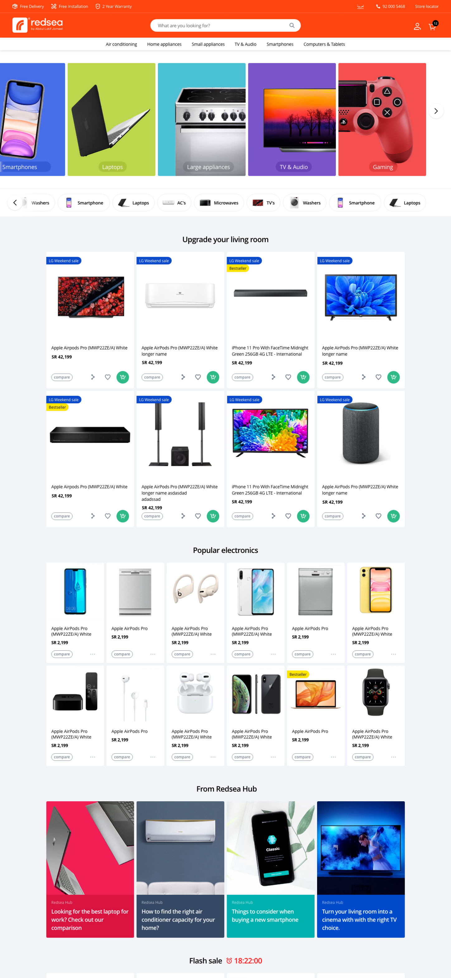
For immersive shopping, our visual design had to be intentionally minimal and easy to understand. We created a design language with clear hierarchy and CTAs to enable this and used familiar iconography for simpler navigation. The new design language was geared to enhance product focus and improve readability.
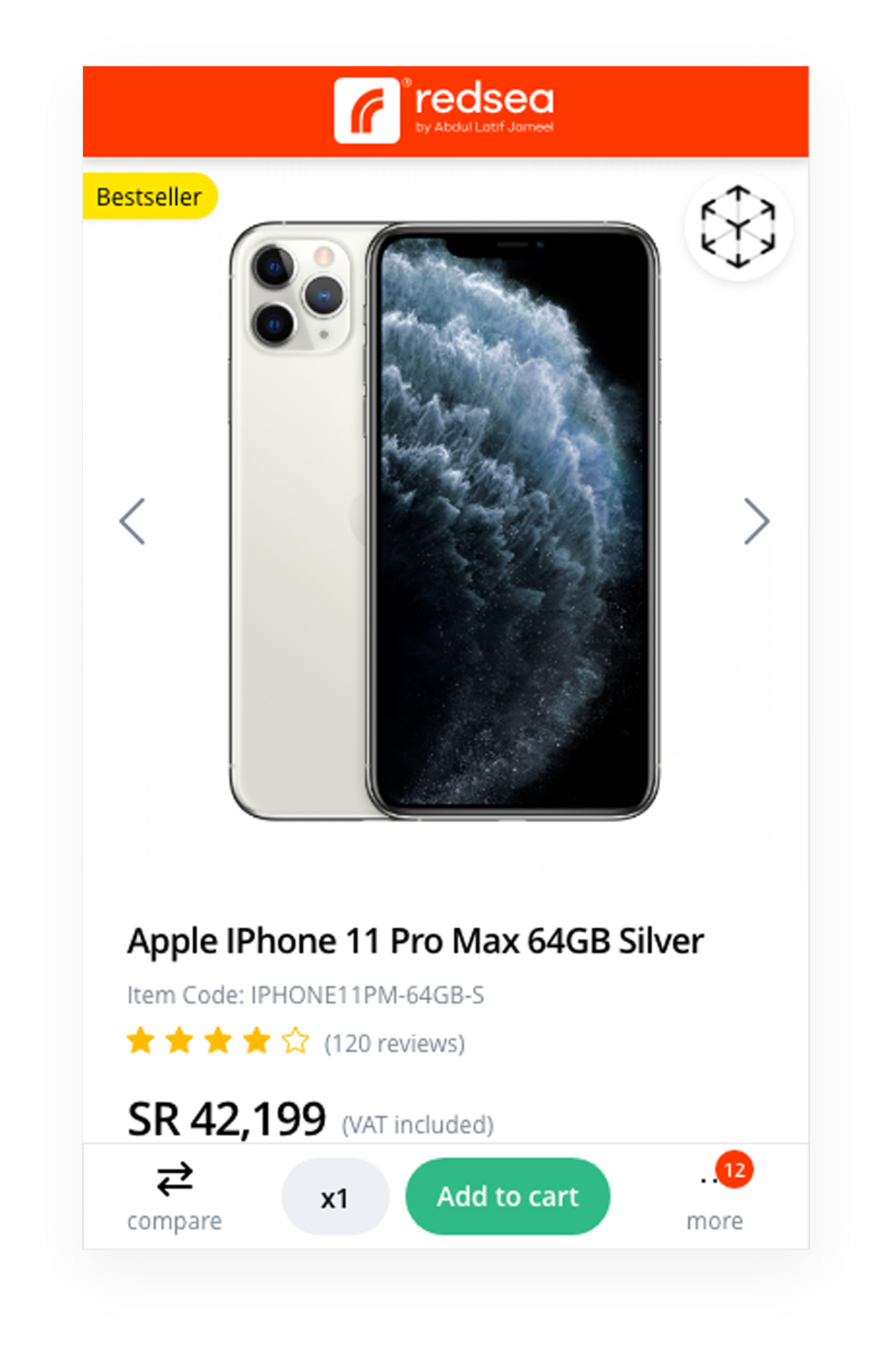
To transform the shopping experience, we enabled Web Based Augmented Reality (WebAR) to deliver hyper-realistic 3D compositions of home appliances in a mobile friendly format. Our AR module infuses accurate shadows and lighting based on the environment to the product being viewed for added realism and immersion.
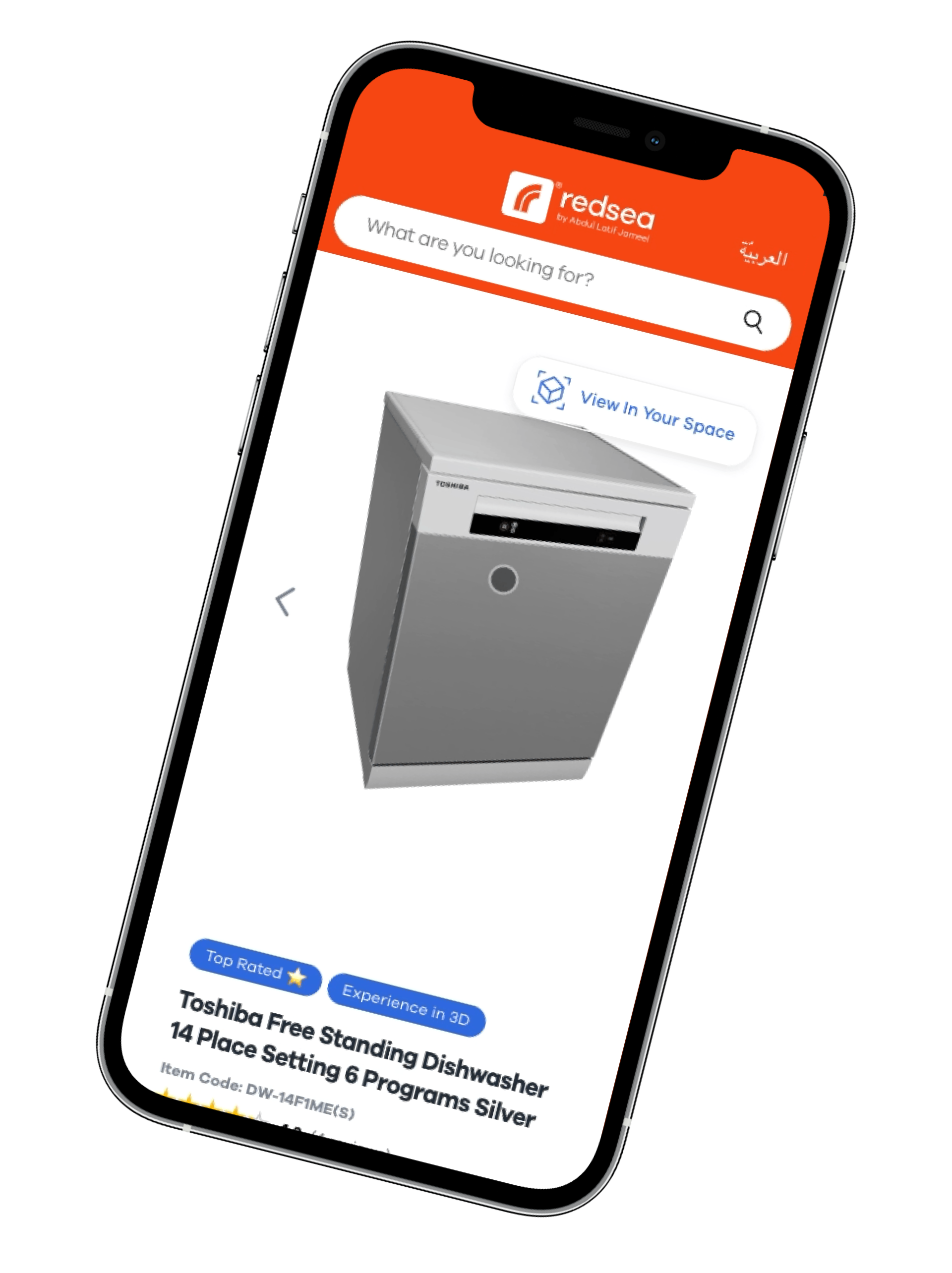
We reimagined eCommerce for Redsea
Scalable Headless Platform
Powered by Next.js, our custom headless solutions for Redsea were developed with an eye on speed, stability and flexibility. Marketing experiments, agile A/B testing and immersive content were an important part of Redsea’s primary strategy, so we set up Contentful’s headless CMS to help them update their content and campaigns on the go.
Bidirectional RTL Interface
In an effort to streamline the experience in both English and Arabic, we designed a flexible interface that would be conducive to mirroring (since the passage of time in Arabic is Right To Left). As part of the asset design, we introduced effective localization, to represent design elements and iconography in their locally preferred variants.
Flexible & Adaptable Cards
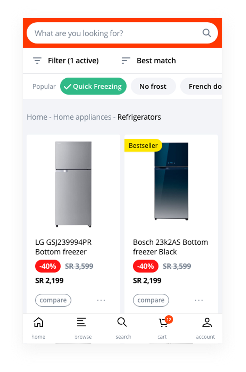
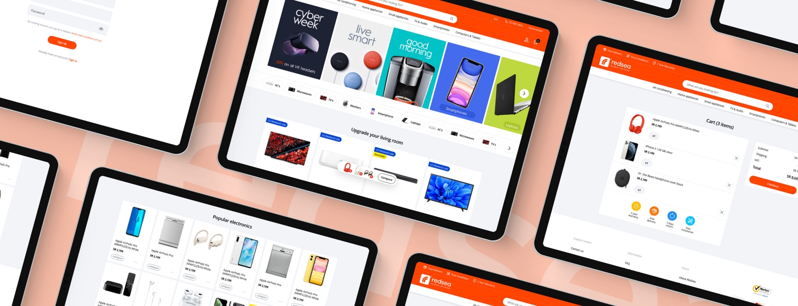
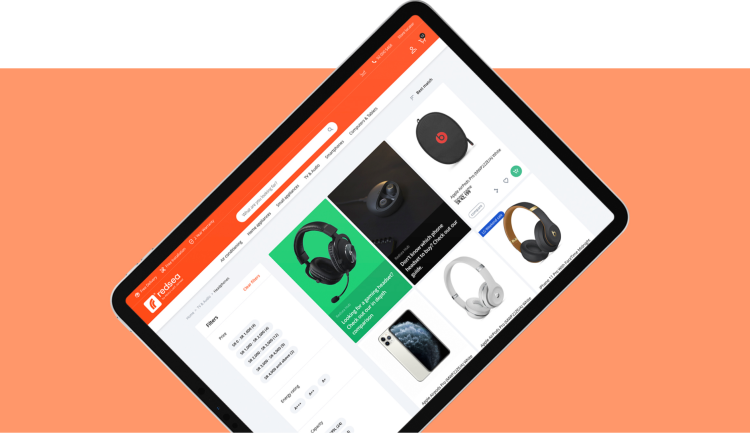
In line with our target audience and their preferences, we took a mobile-first approach. We designed a modular system of cards to integrate products, promotions and content into a single and scalable system. We designed three categories of cards to achieve this - Hub Cards, Bundle Cards and Spotlight Cards, in two adaptable sizes.
Simplified Website Navigation
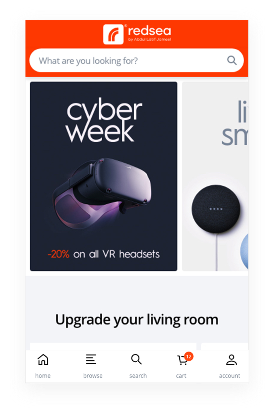
The homepage was designed to simplify navigation, with visual and interchangeable promotions and featured categories showcased above the fold. To simulate an app-like experience, we integrated bottom navigation through tabs, with the most preferred options (Search, Browse) placed in the most easily accessible parts of the mobile screen in an attempt to make it ambidextrous.
Powerful Search Module
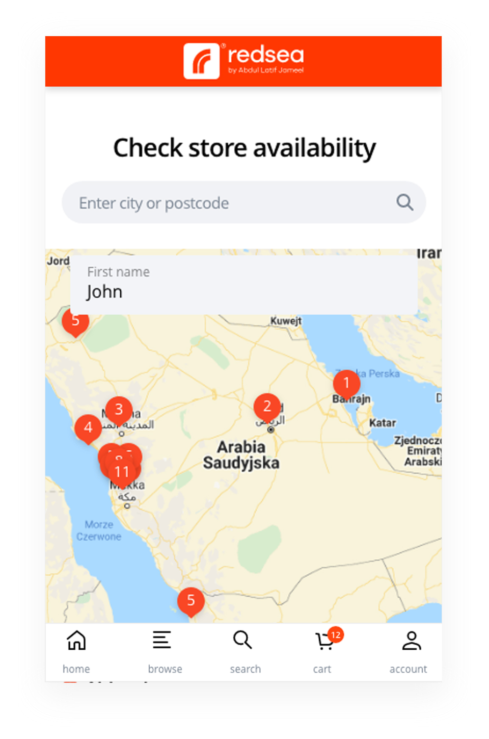
Users love making an informed choice, so our intention was to build a search module that would help them understand what to buy and where to find it. Powered by Algolia, we created an omnipresent search and discovery module that delivers products, content and shopping guides. We augmented the smart search module with features like search history, product discovery, and breadcrumbs for easier navigation.
Intelligent & Persuasive Promotions
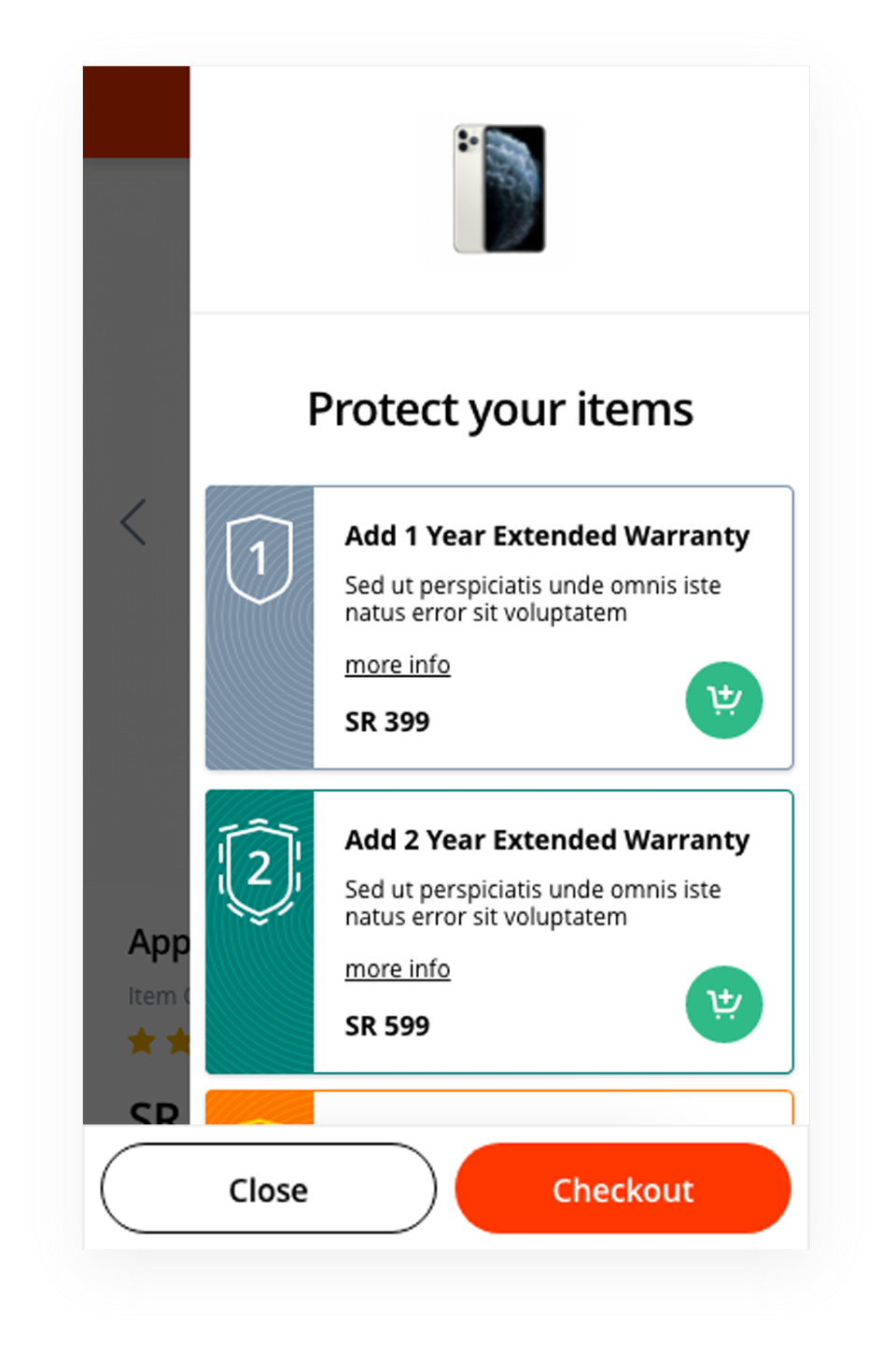
In an effort to improve the AOV across all store purchases, we designed and developed a custom mini-cart with smart recommendations for product bundles, extended warranty options, and added product recommendations. These were positioned closer to the point of purchase to make them persuasive, relevant, and tied to the overall customer experience.
Easy Product Comparison
Since our product data integrity was synchronized, we built a responsive and user-friendly product comparison tool to facilitate informed purchase decisions. We further customised this module with fixed CTA buttons for each product and highlights on the key features. Given that comparison is a primary need, the functionality was made omnipresent across the interface.
